room homepage
Musings about CSS grid, animations, and other things.
25 May 2023Pixel Perfect Problems Part 1: Extra Pixels
The about section in the design takes up 266px along the length and on the app it's taking up 270px instead. Where did the extra 4px come from?! 266px is the height of both images and that determines the height of the about section, but! when the height attribute is not set to 100%, there's this gap of 2px left which is created by the difference in height from the middle section.
For now, I'll let it go. For now.
Pixel Perfect Problems Part 1: Why Does It Look Like That?
The text on the app doesn't look like the text in the design. It seems to rarely ever do. Why is that? Granted the design I’m working off from is just an image and I’m doing magic tricks with Adobe XD (well, no not really - I'll explain later) to determine the dimensions of the elements, it still grates my cheese when the app doesn’t look like the design. *geos and reads Josh Comeau article on pixel-perfection to feel better.
MIDDLE CHILD(ren)
Tablets and everything on the other sides of mobile and desktop screens. This one is always a tricky one. This is when developer becomes UI/UX designer and tries super hard to keep the look and feel of the app consistent and it’s rarely intuitive, sometimes. *developers fighting!
For this app, I decided to keep demarcating the text in the about section from the images by using both images as a border and it looks pretty decent *pats self on back.
The Hero of the Day: flex: 1 1 0% aka flex-1
This was not a grid.
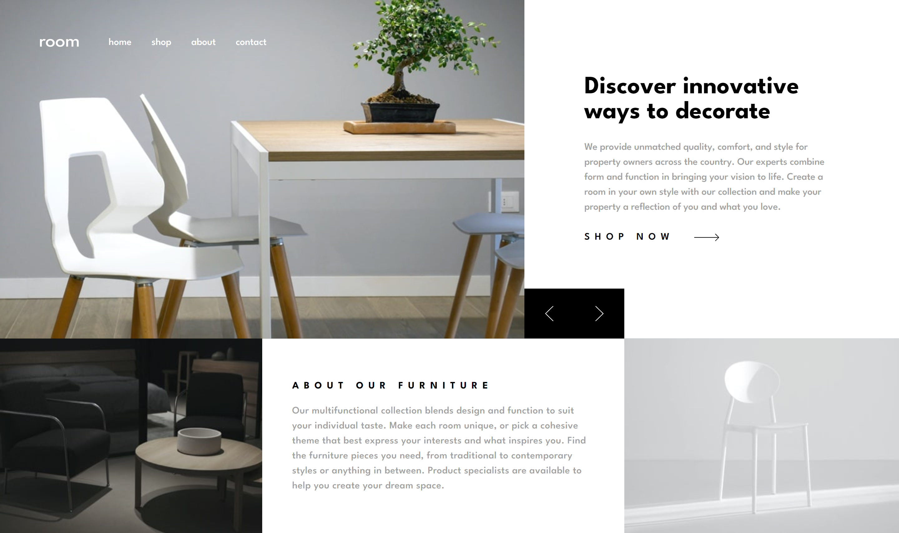
And for the longest time, I was convinced it was. The mathematical gymnastics that emerged made me realise I might not be looking at this right. So, I tried playing with absolute widths and well, that's not the ideal solution for responsive designs. So, what is going on?
The content is free-flowing in each row with the images taking up their full width. And no, the images are not the same size. Took me a while to figure that out - *sad face. Now, how do I make this work?
flex, the shorthand prop for flex-grow, flex-shrink and flex-basis. I needed the images to take up their full width and height and everything else to take up what’s left and flex-1 helped do just that. MDN docs describe prop as, ‘This prop sets how a flex item will grow or shrink to fit the space available in its flex container.’
Animations and micro-interactions: breathing life into our applications
First and foremost, our applications ought to be functional. Once they are functional, they ought to be reliable. From then, they should be usable and at the top of the pyramid, pleasurable.
In Aaron Walter's book Designing for Emotion, this would be the realm of emotion design and what better way to evoke emotion than through meaningful, well-crafted animations.
I am convinced different types and styles of animations evoke different emotions and feelings. They might even accentuate a desired mood and change the perception we have of the web and mobile applications we interact with. If the animations are thoughtful (i.e., augmenting the human experience by providing meaningful feedback) people would likely find that to be helpful and pleasurable. If they are misplaced and unnecessary (i.e., impeding the human experience and being ultimately irritating or bothersome) people will likely start reaching for the close tab button real quick.
Because of the difference it can make between someone being able to complete a task on our applications and someone actively enjoying the experience of completing the task on our applications, I like to put some thought into how I can use animations to improve the human experience on the apps I build. I like to think about the emotion the design is evoking and which animations would best amplify it.
For this app, I was feeling luxury (if that's even an emotion), and I thought a good place to augment that feeling would be when moving the images. The following are the micro-interactions I included:
- Animate the Shop Now button’s arrow function to move inward and outward on hover.
- On change content, have the images slide in from the left and the text slide in from the right. Both animations should work well both desktop and mobile.
- On press of the mobile menu, the top menu should slide down and gently fade in. On close, it should slide up and just as gently slide out.
Infinity later
.
.
.
*tries not the pull hair out. There’s a noticeable flicker when switching images that I am battling with. It makes navigating between images almost painful *cries in why is this happening?!
*sigh - I’ll be heading over to the Framer Motion docs now. Till then.